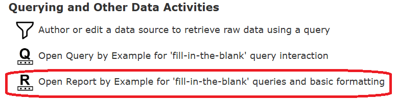
Report By Example Guide
Overview
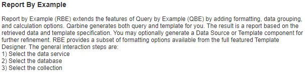
Report by Example (RBE) extends the features of Query by Example (QBE) by adding some formatting, grouping, and user defined calculation functionality. These tools provide a fill-in-the-blanks interface which automatically generates a native query. There is no need to become an expert in any of the various native querying language Qarbine supports. The core features of the querying languages are supported. For more advanced queries, use the Data Source Designer which is a free form query tool.
Prerequisites
Data service configured to access your data. In this example we will access the MongoDB sample store sales data. It is best to have gone through the Quick Start - Query by Example document.
Opening the Tool
You can access the Report By Example (RBE) tool in several ways. Tools can be opened from the signOn page, the home page, and from various tools using the hamburger  menu. From the Home tool.
Alternatively you can open the tool from the hamburger menu on each tool.
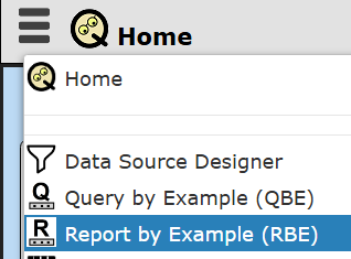
Pressing the control key during the menu click opens the tool in another tab.
Specifying the Data to Query
Select your data service from the dropdown. The Qarbine administrator manages which ones are visible to any particular sign on.

The databases associated with that data service will populate the database dropdown.

The “database” concept varies by the actual cloud data endpoint being interacted with. For example, MongoDB and SQL Server have this concept, while Milvus and Weaviate do not.
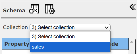
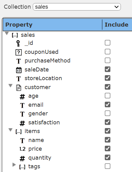
The collections associated with that database will populate the collections dropdown. Select the collection as shown below. “Collections” is the generic Qarbine term. For SQL databases this maps to “tables” for example.
Select a collection from the drop down.
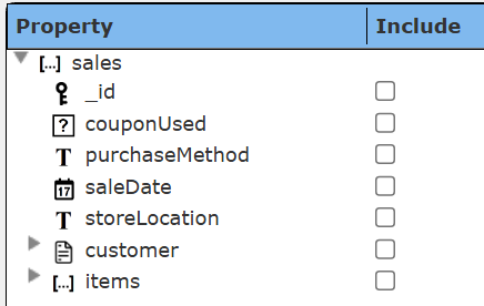
The area below will show the general structure of the collection.
At first the middle area will show some explanatory help information.
Once a field is chosen in the left hand area this middle area will be used to specify query criteria, To see it again choose the Help tab as shown below.
Specifying the Fields of Interest
Refer to the Quick Start- Query By Example document for the initial steps. The data service and database area shown below.

The included fields are shown below.
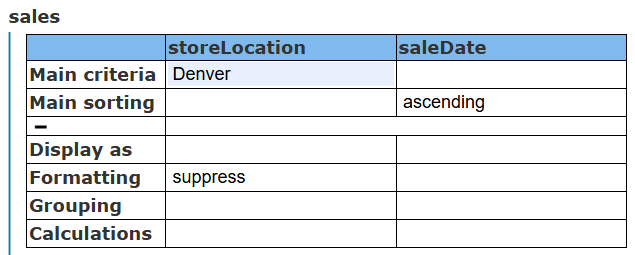
In this example start by limiting the results to sales in Denver. Simply enter “Denver” as shown below.

The right side is updated with the generated native query.
Also select saleDate and sort the orders by that field The query area looks something like the following at this point.

As fields are selected a rough rendering of the analysis template will be shown below the generated query. An example is shown below.
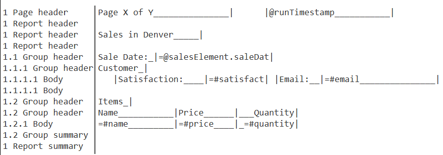
The left hand outline looking text corresponds to the different sections and lines within those sections. To the right of the vertical line are the cells which make up the template’s lines. The ‘#’ prefix is used to reference a field (i.e., #email). The ‘@’ prefix is used to reference a variable (i.e., @runTimestamp). These constructs will become more apparent when you use the Template Designer which provides a rich set of reporting and analysis functionality.
Running the Query
Click the run button  to see your initial results.
Note that the active tab was changed to the “Result” tab as shown below.

To see the underlying data processed click the “Data” tab. This is the same information seen in the Query by Example tool. A sample formatted result is shown below.
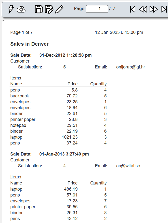
We were able to very quickly obtain information from our NoSQL database data with embedded document and arrays structures. The formatting is mostly raw values at this point.
Click the “Design” tab to get back to the query design content.

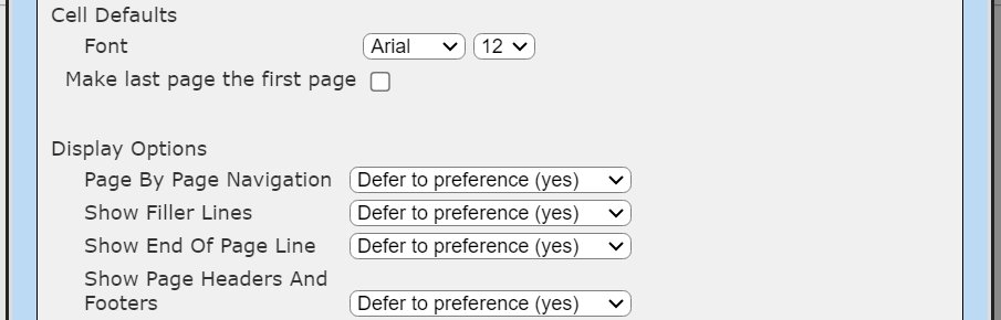
Default Generation Options
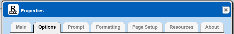
To view several default generation options click the  button to open the property dialog. Activate the Options tab as shown below.

Enter the new report title.

Click OK to close the dialog.
Date Display and Maximum Element Retrieval Options
Note that the sample data above has sale dates stored as UTC dates. By default dates are shown in the local timezone. To change this presentation click the button to open the property dialog.
Check the “ISO UTC” option as shown below.

. . .

This dialog is also one way you can change the maximum number of elements in the answer set you want processed.
Adding Formatting Adjustments
Suppress the store location output since we know this result is only for Denver.
Click the highlighted ‘+’ as shown below.

For the formatting options enter “suppress” as shown below.
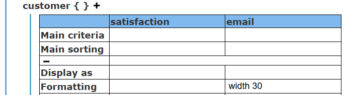
The customer email cell had a width of 20 which may be a bit too small. We can specify a larger width by clicking the highlighted ‘+’ to see more options.

Fill in the formatting criteria as shown below.
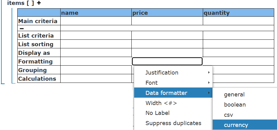
We want to use currency formatting for the price. View the options by clicking the highlighted ‘+’.

This can be done by simply typing in “currency” or by using the pop up menu sequence as shown below.
The cell gets filled in

We’ll use the default template. We also want to right-justify the prices. This can be set by entering “right” into the formatting cell. Shown below is one result.

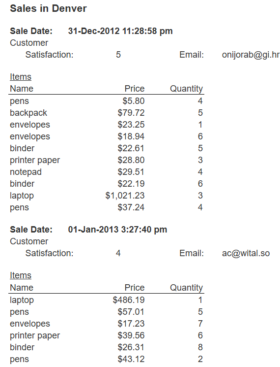
Output from running this is shown below.
Adding Calculations
It would be natural to want to know the number of separate product items, total number of items and the overall value of each order. This can easily be added via the “Calculations” options shown below.
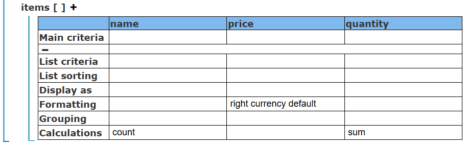
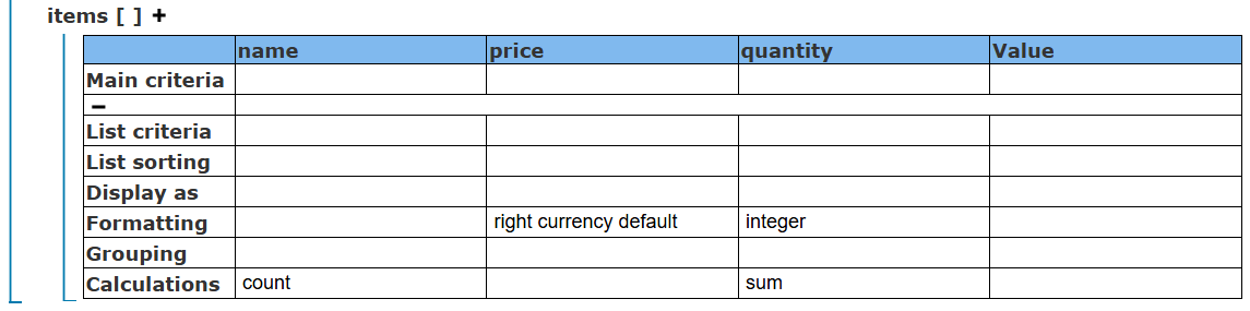
Next we can add an extended price calculation for each product.
Click on  .
.
Sample entry values are shown below.

The overall settings for the items are shown below.
Running this results in the following.
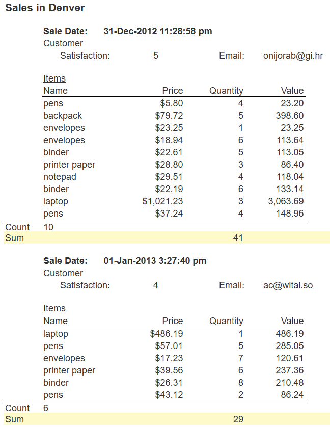
Notice the 2 new summary lines- one for the count and one for the summation.
Report By Example Control Breaks
Walk Through
The example reports below are strictly columnar for the purpose of this explanation. “Control-breaks” are a way of grouping similar data objects together for analysis.
Consider a collection of animals (or perhaps sales objects with team and person fields). The data used is from the following data service and database.

The collection information is shown below.
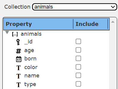
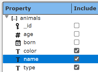
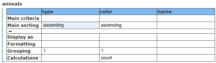
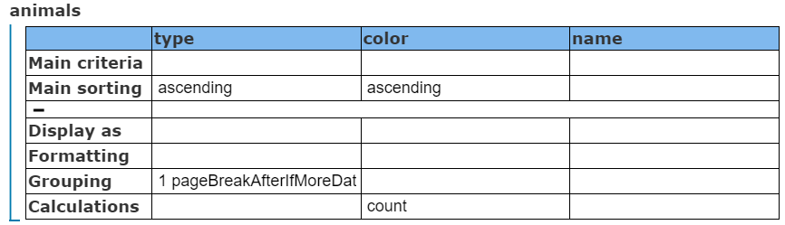
The user first selects the type, color, and name fields.
The criteria area has

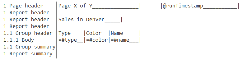
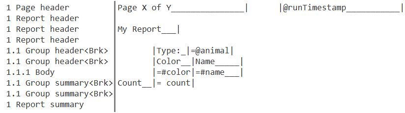
The generated template looks like the following.
Next, the user indicates the data should be sorted first by type and then, within each type, by color.
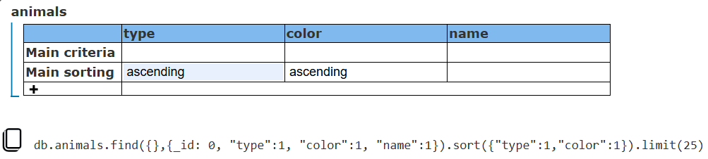
The resulting very generic columnar report is shown below.
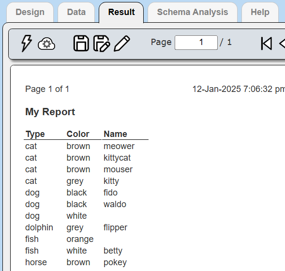
Notice there are several types of animals. In a sales report data could have different sales territories and then within each different salespersons.
Activate the tab shown below.

Next, let’s group the data based on the animal type. Click the highlighted ‘+’ to view the options.

The first control-break is indicated by a ‘1’ below the field of interest. (This is a bit goofy UI wise, but for now….).

The generated template is shown below.
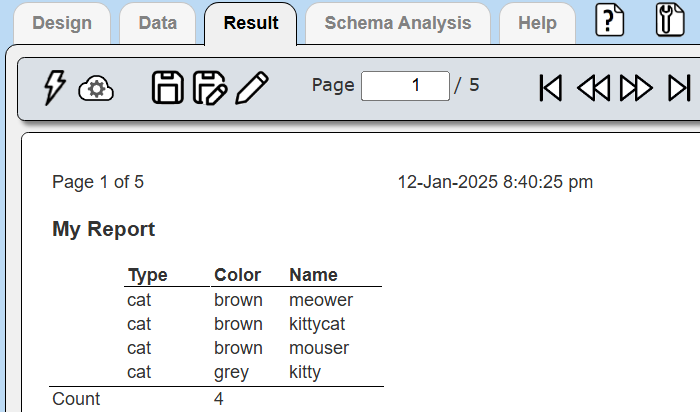
Here is the result with each type creating a separate group.
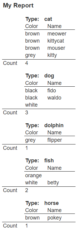
Notice there are also similar colors for some of the animals.
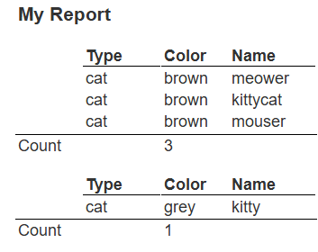
We can also indicate to perform a “control break” if either the type or color changes.
Here is the result for the 2 cat color groups.

For a strictly columnar result option the properties page and navigate to the tab shown below.
Choose the option below.

Running now shows the following.
Other Grouping Options
The value for the grouping must at least specify the group number. If the field is date oriented, then it may be followed by the keywords year, month or day indicating the granularity of the break condition. This uses the dateProperty() macro function to extract the break field value.
To have groups start on new pages, append “pageBreakAfterIfMoreData” to the grouping criteria. Prior to applying this the output may be
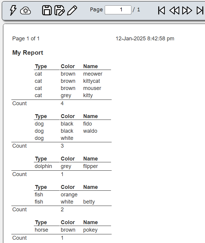
Adding that option to the type break is shown below.
The effect of this on the result is shown below.
Notice that there are now 5 pages of output- one for each type. This can be useful for segregating sales team output by region for example.
Viewing Results
Result Navigation
A template’s formatting options indicate how to display the result.
The result toolbar includes information of how many total pages were generated. You may choose to show all the pages at once or navigate them one by one. For example, for a 2 page result this setting

shows the following in the result toolbar

and one page at a time is shown.
Alternatively this setting

shows the following in the result toolbar

and all of the pages are shown.
Below is a table cross referencing the toolbar result page navigation icons.
| Icon | Description |
|---|---|
 | Go to the first page. |
 | Go to the previous page. |
 | Go to the next page. |
 | Go to the last page. |
Finding Text
The searching for text does span pages in the forward direction.
| Icon | Description |
|---|---|
 | Find the first occurrence of the string starting on the current page. |
 | Find the next occurrence of the string. |
Zooming In and Out
The result content may be zoomed in and out for your reviewing needs.
| Icon | Description |
|---|---|
 | Zoom out. |
 | Reset the zoom to “none”. |
 | Zoom in. |
Next Steps
Once you have a result you can then do other actions such as:
 copy it to the clipboard in JSON format.
 view the JSON in another window.
 send it in various formats to a particular destination such as a download folder.